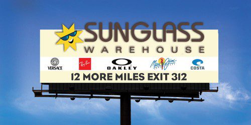
A nice example here of a pretty poor ad turned a lot more effective.

Keep it simple, especially on billboards – people just don’t have time to digest a large amount of information.
The more information you cram on a billboard, the less people will remember it.
~ Tony
